Hover
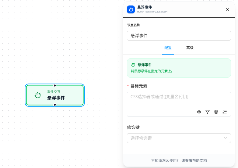
The Hover node moves the mouse over a specified element to trigger hover-related behavior.
Overview
Moves the mouse to a target element and holds it there. Can be combined with modifier keys (e.g., hold Ctrl while hovering).
Quick Start
The following example demonstrates a complete workflow triggered via Context Menu:
- Trigger: Context Menu — right-click on a matching page to start the workflow
- Action: Hover — hover the mouse over the
#target-hoverelement - Execution Page:
https://jtcrpa.com/test/index.html
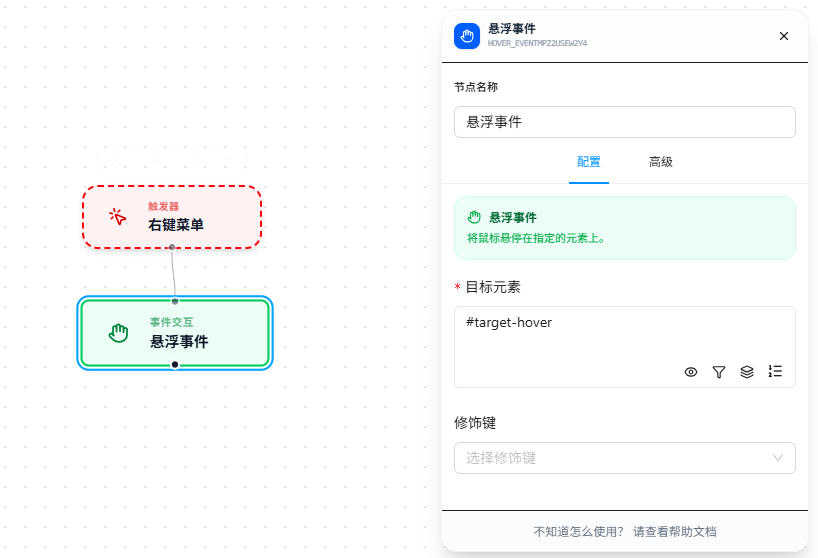
At execution time, first right-click on the matching page and select the menu item to start the workflow, then the Hover node moves the mouse to the target element #target-hover and holds it there, triggering hover-related behavior.
Parameter Reference
| Parameter | Type | Default | Description |
|---|---|---|---|
| Target Element | Text | — | CSS selector, required |
| Modifier Keys | Multi-select | — | Multi-select: Ctrl, Shift, Alt, Meta |
FAQ
Hover-triggered UI appears then disappears instantly
Symptom: The UI triggered by hover appears and then vanishes immediately.
Cause: A subsequent node immediately performed another action causing focus to shift, or the page requires continuous hover to maintain the display.
Solution: Place the node that interacts with the hover-revealed element (e.g., clicking an expanded menu item) immediately after the Hover node, without inserting other nodes in between.