Checkbox
The Checkbox node operates on <input type="checkbox"> and <input type="radio"> elements, toggling their checked state.
Overview
Three operations are supported: Check, Uncheck, and Toggle (invert the current state).
If the selector points to a label or wrapper div, the node automatically finds the actual checkbox or radio element inside.
Quick Start
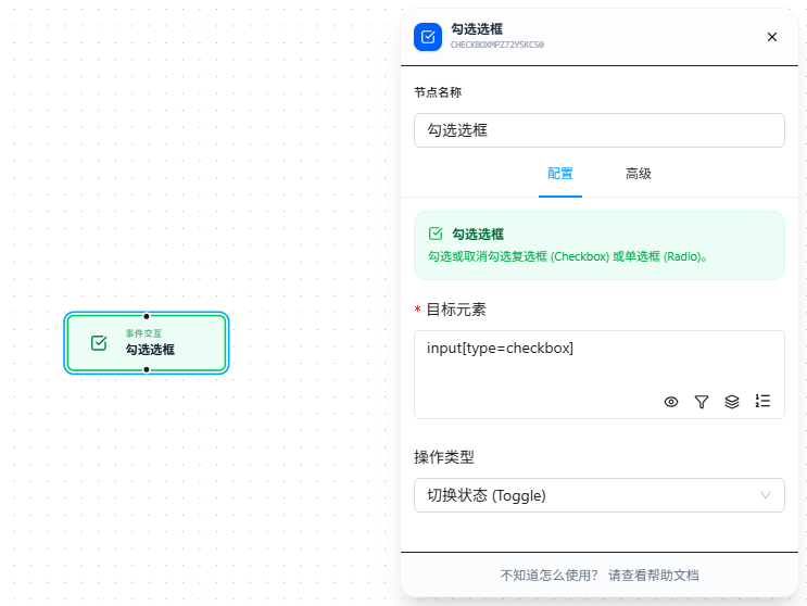
- Drag the "Checkbox" node onto the canvas
- Fill in "Target Element" CSS selector (required), pointing to the target checkbox or radio
- Select the operation type: Check / Uncheck / Toggle
- Execute
FAQ
Checkbox is checked but associated UI doesn't change
The checkbox is checked but the associated form section didn't expand or the button didn't activate.
Solution: Add a Trigger Event node after the Checkbox node to manually dispatch a change event.